DirectEd
Project Overview
About Directed
DirectEd is a startup that identifies high-potential students in Kenya and Ethiopia and supports them with the resources and training required to start a successful career as remote software developers. It utilizes cryptocurrency for safe and direct donations from donors to students.
My Role
I was a UX/UI designer with a team of three other designers and a product manager. Together, we worked cross-functionally to re-design the company website and design a donation page to enhance users’ experiences. I was mainly in charge of the home page re-design while taking into consideration of the donation page in my final product.
Deliverables
User flows, Competitive Analysis, Heuristics Analysis, Wireframes, Brand Identity, Style Guide, Prototypes, Animations, Interaction Designs, Presentation
Tools
Figma, Miro, Notion
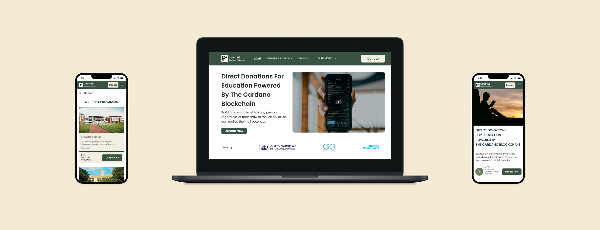
Final Prototype
The Problem
The main problem for Directed was that it did not have a graphic profile for its organization. Its website needed a smooth flow for users to learn about the program and then donate using a crypto wallet.
Defining the Problem
After going through the success criteria, our team came up with these design challenges:
Change the brand identity for users to feel secure and confident when donating to DirectEd.
Re-design the home page that helps users learn about the organization and connects to the donation flow.
Create a donation page compatible with cryptocurrency for users to make safe and traceable donations.
Competitor Analysis
To better understand our competitors and create a straightforward website, we studied charities or companies that utilize cryptocurrency. When looking at these competitors, we documented qualities they hold that we can learn from. Here is a summary of our findings:

Kickstarter- a benefit corporation that maintains a global crowdfunding platform.
Pros:
Excellent at highlighting project stories, updates, and risks.
Gives users incentives to donate.
Cons:
Homepage is not as relevant.

Kiva- a non-profit organization for people to lend money to low-income entrepreneurs and students in 80 countries.
Pros:
Has essential information all in one scroll
Donations with pictures and status bar to encourage more donors
Cons:
The website does not have appealing visuals.
User Stories
After conducting a competitive analysis, our team gathered again to focus on DirectEd’s users in order to combine our learnings with users’ needs into our final product. We then brainstormed user stories depicting our users’ thoughts and grouped them into three categories: users want to feel confident donating, want to learn what DirectEd does, and want a simple donation process.
As a donor…I want to…
As a donor, I want to feel confident donating to DirectEd, knowing it is safe and reliable.
Finally, we decided on this statement that best articulates the goals of our design:
User Flows
With a better understanding of our users, our next step was to design two flows that would allow a smooth transition from the main page to the donation page. We decided that each page should have a donation button to encourage more donations.
User flow 1: The Home Page
There will be a vertical scroll with enough information users need to learn about DirectEd. There will also be separate tabs that lead to additional information. Finally, there will be a sticky header that includes a donation button, so users have the option to donate whenever they decide to.
User flow 2: The Donation Page
On the donation page, users can view their donation history and donation updates. Because they will be using cryptocurrency, they must connect their crypto wallets first. Then, they will select the high school and the amount to donate. After each donation, they will receive a transaction confirmation.
Wireframes
Desktop and DApp wireframes
The next step is to put our user flows into visual designs. We started by creating both website and mobile wireframes. We included new features for the web page, such as a video, straightforward problem statements, and clear solutions to better inform our users. We also designed a separate donation page(DApp) that accommodates cryptocurrency.
Mobile Wireframes
Visual Design
Brand Identity
For our next step, we needed to create a new color palette and font style to appeal to more users. We decided on a green and blue palette that resembles the colors of nature. These colors give the appearance of calm, intelligence, and trustworthiness, which are DirectEd’s traits we want users to see.

The Re-design:
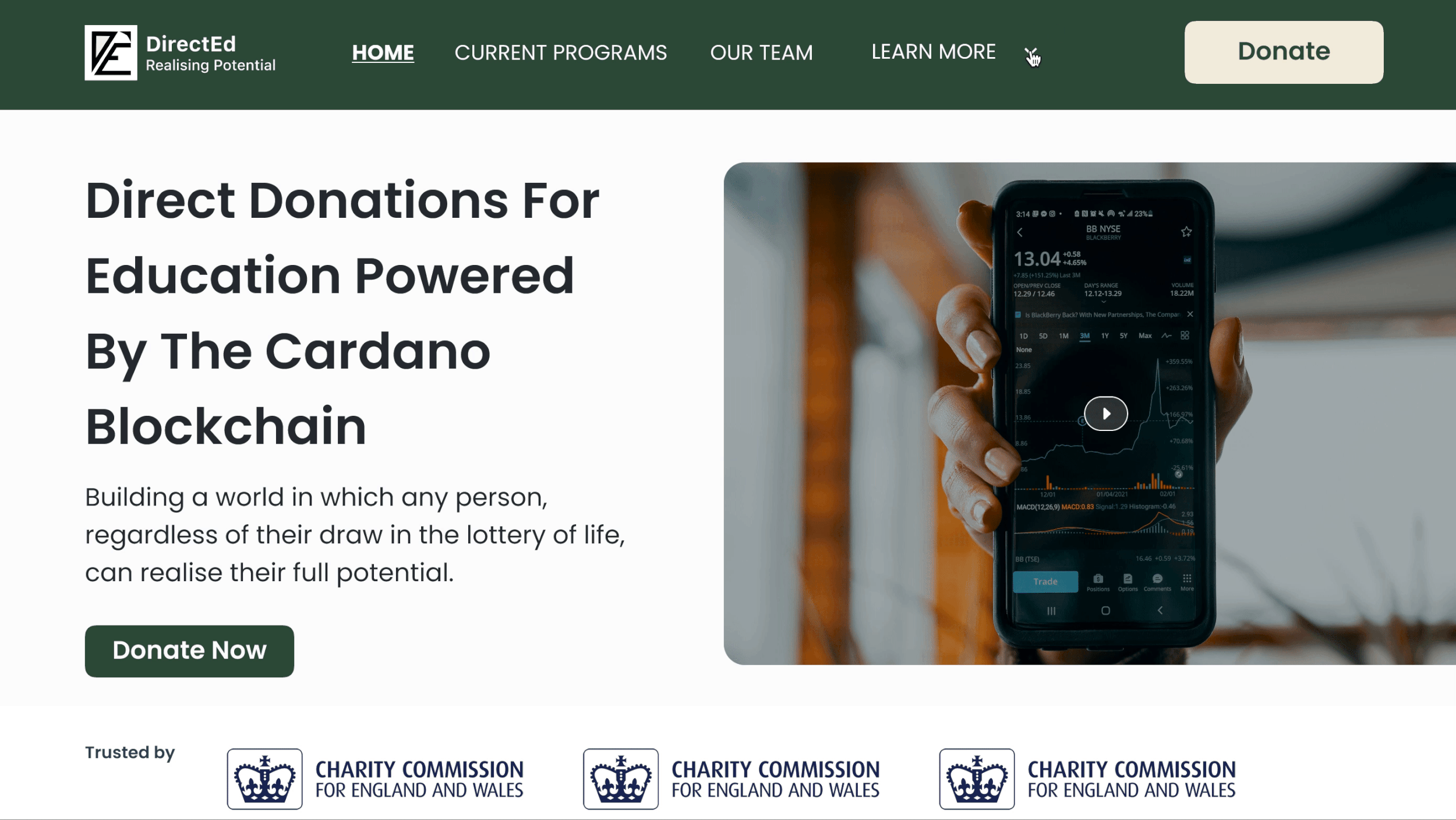
Landing Page
Showing the Mission: DirectEd’s goal for the landing page was to show its mission and attract users. However, with the original website design, it could not convey its message clearly. We then analyzed the design’s weaknesses and improved them..
Before
Plain header without a donate button
The mission statement does not explain the program clearly
There are unnecessary buttons on the home page
Disorganized color palette and font style
After
New header with a clean design and donate button. A header allows users to navigate all resources on our site in one place. The added donate button further gives users access to making donations wherever they land on, greatly increasing the chances of users donating.
A strong and bold headline that clearly explains DirectEd’s mission
Informative video explaining DirectEd’s purpose
List of endorsements to show credibility
Updated fonts and colors for increased visibility and appeal
The Problem Statement
Seeing the Problem
The original “Problems Page” had a plain design, which made it challenging to grab users’ attention. Hence, DirectEd could not spread awareness of the problems they were solving. We decided to change the entire design to create a more engaging experience.
Before
There is unnecessary white space
The visual design mimics that of an uninteresting PowerPoint
The image is unrelated to the problems
After
We added descriptive images for each bullet point
We also added a new visual to represent the “Problems Page” better
Updated fonts for better visibility
We switched to a cleaner button design
The Solutions Page
Presenting the Solutions
Similar to the “Problems Page” design, the “Solutions Page” also faced the dilemma of being plain and uninteresting. We made sure to eliminate these issues in the redesign.
Before
There is an abundance of white space
No use of color to attract users’ attention
The image is unrelated to the solutions
After
We added a colored background to draw users’ focus
We switched to a three-column format to showcase each solution distinctly
Users can click “Read More” for additional information
Making the Prototype
Adding Animations
To increase user engagement, we created an interactive prototype for users to experience DirectEd at its fullest.

We made flip cards for users to learn more about how DirectEd stands out from other charities. A flip card allows users to get more information without entering a new page, which increases efficiency.
We added a dropdown menu for users to access the additional pages.
The Final Design
After the re-design and prototyping, we created our final website with a donation page:
Desktop and DApp Prototype

Mobile Prototype

Conclusion
This project was an enriching experience for many reasons. Our main goals were to create a smooth flow for users to learn about the program and then to encourage users to feel safe donating using a crypto wallet. After initial rounds of testing conducted by the company, we learned that our designs achieved the KPI of 90% of respondents reporting they understood DirectEd’s mission within two minutes and further gained users’ trust in the site which increased user donations by 7%. For my next steps, I would like to take these findings and incorporate them into an even more finalized product to see more improvements from DirectEd’s site.
Aside from the positive results from my product, I learned about the world of cryptocurrency and saw how it could be used to solve real-world problems.”. I went from only hearing about crypto to designing a full donation page.
Furthermore, I was amazed to see my team and I coming together to form perfect solutions. I believe that the experience we produced will channel more donations to students in Kenya and Ethiopia.
Finally, I truly felt growth in my design skills through designing and redesigning alongside my team members. In the future, I feel ready to take on projects from different fields to enhance my design career.