
Kanii
Scroll ↓

PROJECT OVERVIEW
Kanii is a media streaming app designed for a more personalized entertainment experience. It offers a premium service where users can sign up whenever they want for an even finer viewing.
About Kanii
As the UX/UI designer for the company behind Kanii, I interviewed potential users, mapped the IAs, created interactive prototypes, conducted usability tests, and finalized the designs.
My Role
Interviews, User Flows, Usability Testing, Wireframes, Brand Identity, Style Guide, Prototypes, Interaction Designs, Usability Testing, and Presentation.
Deliverables
Tools
Figma
Final Prototype
Defining the Problem
Kanii is a media streaming app that utilizes a freemium model. Recently, its company decided to offer a premium subscription service to users. As the designer, I need to design an experience for users to subscribe and pay a monthly fee.
Create the opportunity for new users to subscribe to the premium product upon registration in the signup flow.
Create the opportunity for returning free users to become paid subscribers in the sign-in flow and within the product.
Improve the Kanii experience for users.
Design challenges
Research
I then interviewed five potential new users to understand their decision-making process.
User Interviews
1. What would users change to current services?
2. How do users choose what content to watch?
3. How do users choose which service to use?
Interview Goals
I interviewed 18-24 years old who are tech-savvy, budget-conscious and view media as an important part of their lives.
Who?
After each interview, I wrote down notable insights. From these notes, I highlighted a common pattern.
Synthesize Insights
Users would like to have more personalized settings for streaming services.
Users tend to choose shows based on friends’ recommendations, good reviews, and popularity on social media.
Users often choose streaming services to watch exclusive shows the services offer.
Key Insights
To better understand streaming services, I read a number of articles discussing factors such as pricing, customer satisfaction, and customer behavior.
Secondary Research
I first learned that users care most about the cost of the services they are paying for. Many users have shown dissatisfaction with the price increase in streaming services such as Netflix. Therefore, it is important to keep the pricing within a reasonable range to keep customers pleased.
Pricing matters most
I further learned that to interest the audience, the images on streaming services should be familiar and pleasing to the audience. For example, users are more drawn to shows with familiar and attractive covers or actors on them. Hence, it is crucial to design an app with an appealing UI.
Appealing designs
Users will choose a streaming service based on the content it provides. Sometimes, one hit show is enough for users to subscribe to a streaming service. In that case, streaming services need to keep their content engaging to attract more users.
Keep the content engaging
To create a streaming app that stands out from the rest, I need to include reasonable pricing, more personalizations, and engaging UI.
Research Insights
User Flow
With better knowledge of my users, I was able to create a user flow to help guide me through the mobile site's design. I imagined myself as a Kanii user and listed the steps needed to explore all of Kanii’s functions. Part of the process includes signing up, choosing my favorite content, and choosing a subscription plan.
Style Guide
For this project, I decided to go with a fun and bright color palette that fits the target demographics.
Color palette
Typography
Brand Platform
Accessibility
I used colors that passed the WCAG color contrast to achieve accessibility.

Low Fidelity Designs
From the user flows, I created my first low-fidelity designs. They helped me quickly plan out my vision for the app so I could see if certain functions were feasible in real life.
Returning users will enter their email and password to log in. They can choose to subscribe to premium if they haven’t already.
User flow 1: Login
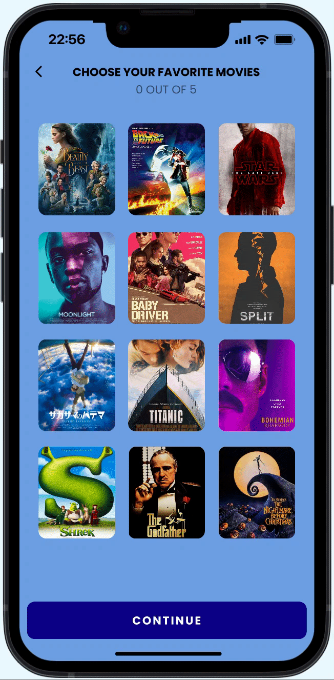
New users will create an account and choose whether to subscribe or not. They are asked to select their favorite content for a better viewing experience.
User flow 2: Create an account
User flow 3: Subscribe to premium
Users can choose from a monthly or yearly plan.
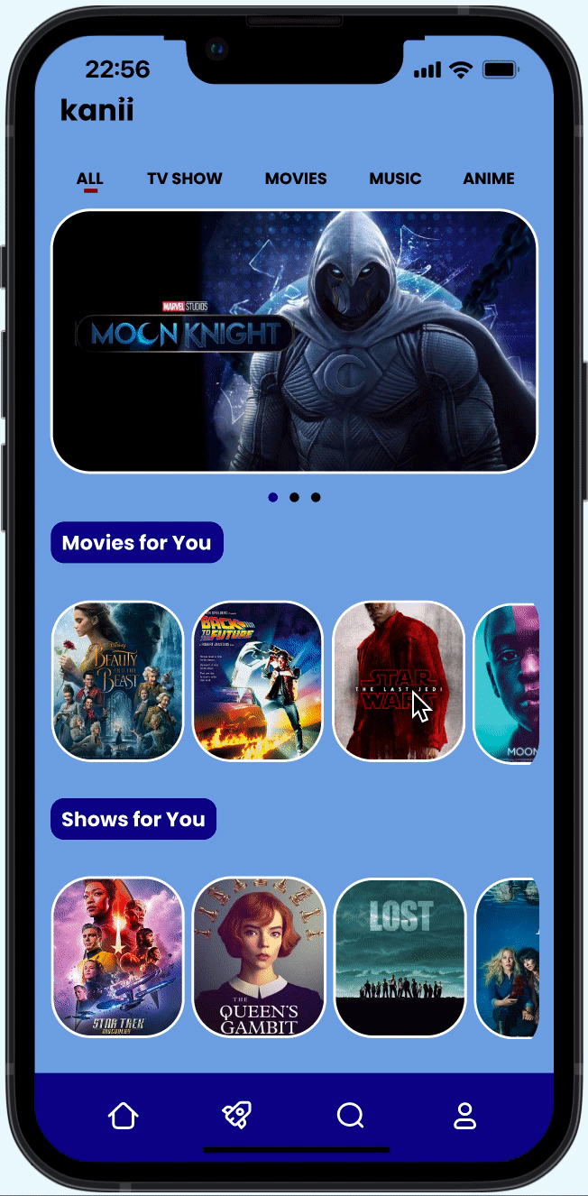
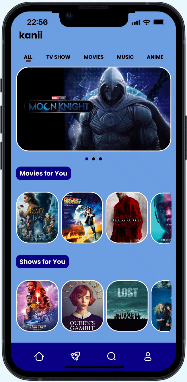
High-fidelity designs and Prototypes
I then transformed my low-fidelities into high-fidelity designs using the brand identity I created. From the high fidelities, my first round of prototypes was born and ready to be tested by users!
First Prototypes
Usability Test Round 1
After creating a research plan and test script, I conducted 5 usability tests with users who fit my website’s target demographics. By testing three different tasks, I was able to collect data across platforms regarding unintended task sequences or unclear icons.
Research Plan & Test Scripts
Create an account.
Browse content of interest.
Subscribe to premium.
Tasks
Usability Issues by Priority
I ranked each issue by priority and created solutions for each.
The subscribe flow after logging in is difficult to find, which could lead to fewer subscriptions.
Critical issues
Solution
I changed the subscribe button to help users find it more easily.
Movies, shows, and artist boxes are unclear when selected. Pages users are interested in are not created.
Major issues
Change the design of boxes to a lighter color when not selected, then solid. Or add a symbol indicating the box has been selected. Create more exploratory pages for users.
Solution
Minor issues
Buttons are not synchronized, which makes the app seem disorganized.
Solution
Fix margins and fonts for buttons.
Prototype Changes
I added a horizontal scrolling menu for a more engaging user experience
Horizontal Scrolling
I created an interactive menu for users to have more exploratory options
Interactive Menu
I changed the contrast of the images to improve accessibility.
Image Selection
Usability testing Round 2
After learning the weaknesses of my first prototype, I revisited the problem areas and improved my prototype. I then found 5 new users to test it. Here are the usability issues I found.
Critical issues
Movies, shows, and artist boxes are still difficult to see when selected.
Change the design of boxes to an even lighter color to create more contrast when not selected.
Solution
Major issues
The icons for artists should match the same style as the icons for movies and shows
Solution
Find new photos for artists to keep the styling consistent.
Final Interactive Prototype
After two rounds of usability testing, I fixed all the problems I identified and further added more UI designs to polish my prototype. Here is my final prototype:
Reflection
Kanii was my second project as a UI/UX designer. Having prior experience from my first project, I felt an increase in my design skills and abilities. For this project, I immensely enjoyed breaking down current streaming services and adding my personal takes to them. I went for a bolder and more modern color palette. I also added features such as horizontal scrolling to make my prototype realistic. I further incorporated an in-app chatting and party viewing function for users to enjoy Kanii together.
Overall, I was able to apply my creativity to create a media streaming app with greater personalization than what existing apps have to offer.
Looking forward, I would like users to enjoy Kanii and explore all the functions it contains.